In previous posts, we explored the core of the Project Weather, focusing on its basic backend-frontend platform and its AI prediction capabilities. Once these points were achieved and the application was operational, certain improvement aspects arose concerning a more fluid and intuitive frontend experience.
This post unveils the “extras”—the significant enhancements and design decisions that transformed Project Weather from a basic pilot into a comprehensive, production-ready weather dashboard. These improvements, although not directly related to AI prediction, were crucial for building a reliable, scalable, and delightful user experience.
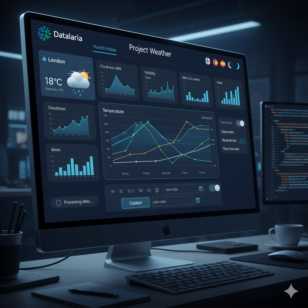
1. Expanding Metrics and Data Collection: From Basic to Comprehensive
Our initial weather dashboard, while functional, only provided basic metrics like temperature, wind, and humidity. To evolve into a truly useful weather station, we needed more data. This required significant modifications in both our backend data collection script and the frontend visualization.
New Metrics & Dynamic Visualizations
We revamped our Python read_weather.py script to fetch and store four new critical weather variables:
- Cloudiness (%): Percentage of sky covered.
- Visibility (km): Distance of vision (crucial for fog or haze conditions).
- Rain (mm): Rainfall in the last hour.
- Snow (mm): Snowfall in the last hour.
In the frontend, effectively visualizing these diverse data types was key. We implemented conditional logic within Chart.js to adapt the chart type based on the data:
- Line charts for continuous variables like temperature and wind speed.
- Area (filled) charts for humidity and cloudiness, providing a sense of accumulation or coverage.
- Bar charts for precipitation (rain/snow), as bars visually represent accumulated amounts more intuitively.
Automatic Data Migration
A common challenge when adding new data fields to an existing system is managing historical data. We designed a robust backend system to automatically detect and migrate older CSV files (with 11 columns) to the new 15-column format. Crucially, this system elegantly handled the missing values for the new metrics, filling them with sensible default values (e.g., 0 for rain/snow), thus preventing any loss of historical context and ensuring data integrity across the entire dataset. This automated process was vital for a smooth, fluid transition without requiring manual intervention.
2. Comprehensive Internationalization (i18n) System: A Truly Global Application
To make the Project Weather accessible to a wider audience, a complete internationalization (i18n) system was a top priority. We transformed the web application into a fully bilingual platform (Spanish/English) with dynamic language switching, without the need for page reloads.
Translation Architecture
We built a centralized const translations dictionary in JavaScript, containing all text strings used in the application. This approach ensured consistency and simplified maintenance.
- Static Texts: HTML elements requiring translation were tagged with a
data-i18n-keyattribute. A JavaScript function then automatically iterated through these elements, replacing their content with the corresponding translation from the active dictionary. - Dynamic Texts: Crucially, all JavaScript logic responsible for generating dynamic strings (e.g., “Feels like,” “Wind speed,” KPI labels, and chart tooltips) was refactored to read directly from the currently selected language dictionary. This ensured that every piece of text, regardless of whether it was static HTML or dynamically generated, was correctly localized.
Date and Number Formatting
Beyond text, cultural formatting for dates and numbers is essential. We leveraged Intl.DateTimeFormat and integrated it with Chart.js to ensure that dates on chart axes and in data cards were displayed in the culturally correct format (e.g., “10 nov” vs. “Nov 10”). Number formats (e.g., decimal separators) were also adapted accordingly.
Persistence
To enhance user experience, the language preference is stored in localStorage, so the application remembers the user’s chosen language across visits.
3. Advanced Interactivity: Custom Time Range Filtering
Empowering users with precise data exploration capabilities was a key objective. We significantly improved the dashboard’s interactivity by introducing advanced time range filtering.
Custom Range Selector
Alongside the predefined ranges (1H, 1D, 1W, 1M, 1Y, All), we added a “Custom” option. Activating this option dynamically reveals two date input fields (start-date and end-date).
Dynamic Filtering Logic
The core rendering engine for our charts was modified to accept arbitrary start and end dates. This allows users to define any time window. Upon selection, the system recalculates all statistics (maximums, minimums, and averages) and re-renders the graphs based exclusively on the user-defined period. This granular control dramatically improves the analytical utility of the dashboard.
4. UI/UX Enhancements: Polishing the User Experience
The final touches on UI/UX consisted of refining the aesthetics and usability, transforming a functional dashboard into a polished and engaging application.
Dynamic Weather Icons
We developed a smart getWeatherIcon logic that analyzes the weather description returned by the API (e.g., “scattered clouds,” “drizzle”) and the cloudiness percentage. This function dynamically displays the most representative icon from Feather Icons (sun, cloud, rain, snow, fog) alongside the city name and current weather condition, providing immediate visual cues about the weather.
Professional Corporate Header
The simple page title was replaced by a professional-grade <header> that integrates:
- The Datalaria logo.
- A dynamic “How it was made” link that intelligently switches the URL to the English or Spanish version of this blog post, depending on the application’s current language setting.
- Grouped configuration controls for language selection and dark mode toggle, providing a clean and organized interface for user preferences.
Loading Feedback
Addressing visual bugs and improving user feedback during asynchronous data processing was critical. We implemented a subtle loading spinner and clear status messages that appear while data is being fetched and rendered. This prevents users from seeing blank or partially loaded charts and assures them that the application is actively processing their requests.
Conclusion: A Holistic Approach to Application Development
While the AI prediction model is a testament to the power of machine learning, these “extra” features are evidence of the comprehensive development approach adopted with the Project Weather. They demonstrate that building a truly valuable application goes beyond its core functionality, encompassing:
- Robust Data Engineering: Ensuring data quality and smooth migration.
- Global Accessibility: Through thoughtful internationalization.
- User Empowerment: Via advanced filtering options.
- Refined User Experience: With intuitive visuals and clear feedback.
The result is a weather dashboard with a degree of intelligence, intuitive, and easy to use, in which backend logic and careful frontend design converge.
Finally, these improvements represent the closing of the first operational version of the project, and from which, in the medium term, we will incorporate new enhancements and changes as they are required and allow us to improve the user experience and experiment with new features and characteristics.